#1: Remarket to Potential Customers Who Abandon Carts
This Bluehost ad gets Facebook advertising right on so many levels. Bluehost uses this ad in the middle of the sales funnel to reduce cart abandonment. The ad appears to people who have added a Bluehost service to their cart and prompts them to return to the website and complete their purchase.
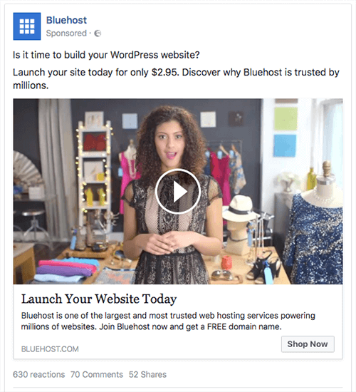
A cart abandonment ad from hosting company Bluehost.
The ad features compelling copy, beginning with the question to remind someone they’re in the middle of a decision about building their website. The second line hits the low-cost barrier to entry to using the Bluehost service, only $2.95. Next, the ad uses text to provide extremely heavy social proof: trusted by millions of customers.
Video makes this ad even more effective. Video is currently the best-performing type of content; people watch more than 100 million hours of video on Facebook every day. Also, by featuring different business owners, the video reinforces the social proof mentioned in the ad copy.
Below the video, the clear link title, description, and call to action (CTA) also make this a strong ad. The link title, “Launch Your Website Today,” is clear and direct, design to compel users to take the final action to launch their website.
After the link title, the link description reinforces social proof that appeared earlier in the ad copy and video. The description also highlights another benefit of joining: getting a free domain. The CTA, Shop Now, reflects what the ad would like customers to do: prompt them to finalize their buying decision and launch their site.
#2: Increase Product Trials
In this ad, UK mattress company Simba uses the carousel ad format with short, feature-rich videos and a single image to market its hybrid mattress.
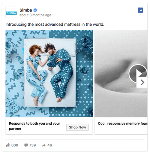
A carousel ad from mattress company Simba.
The single-sentence copy is used to grab the target audience’s attention by piquing their curiosity. Also, the brevity pushes the target audience to consume the carousel cards that highlight the product features.
Attention-grabbing video, particularly in the first carousel card, is another excellent feature of this ad. The short, looping videos make the ad more immersive and engaging than regular images. Finally, the use of a single image in the second-to-last carousel card breaks the expectation of another video and effectively draws attention to the 100-day trial offer.
As people look through the carousel, each carousel card title is used to highlight either a consumer benefit or a product feature. The card text is concise so it isn’t cut off in a mobile news feed. The Shop Now CTA reinforces the desired trial mindset.
#3: Deliver Top of the Marketing Funnel Content
In this ad, Moz features a video from its Whiteboard Friday series. The topic, choosing a domain name, is a great example of top-of-funnel content that delivers value to the target audience. This valuable information also builds recognition and authority for the Moz brand and Rand Fishkin, the CEO.
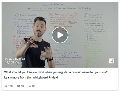
This video ad shares educational content from SEO company Moz.
Begin your ad with a question related to the video, the ad copy makes the topic top-of-mind for the target audience. The question should also build curiosity about the answers to the question.
The second line of copy features a CTA, Learn More. As the video autoplays, this CTA gets the target audience to stay and watch the rest of the video. The CTA also references the video series title, helping build further brand awareness.
This ad is another excellent example of video. Instead of the usual floating head, the video includes a whiteboard, which makes it feel like you’re being taught at school. The in-depth video helps deliver on the expectation by educating the target audience about eight rules for choosing a domain name.
#4: Remarket to Potential First-Time Buyers
Eco-baby brand Kit & Kin uses a retargeting ad that features a carousel of images and promotes a 25% discount on their eco nappies to encourage a first purchase.
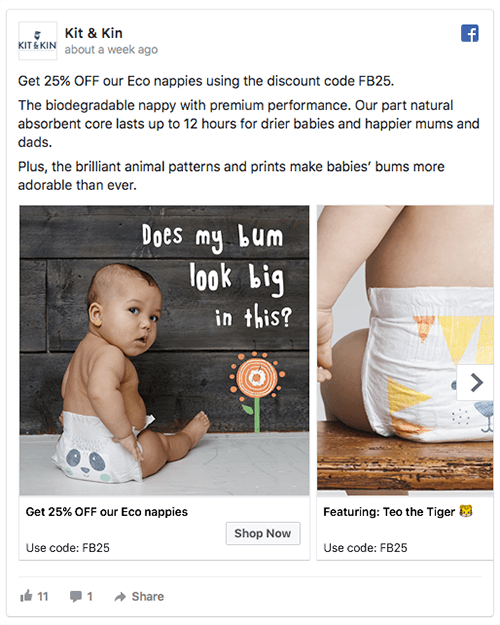
Product retargeting ad from eco brand Kit & Kin.
The ad copy is used to emphasize the benefit to the target audience. The first line is written to clarify that this ad offers a promotion, specifically a 25% discount deal. The first line also clearly states the discount code that someone needs to use to take advantage of the offer.
The rest of the copy is included to keep the focus on benefits. After stating a product feature, the copy describes how the feature benefits the buyer: “drier babies for happier mums and dads.” The final line of copy highlights another product feature, the print on the nappies and the aesthetic benefit to the buyer.
The carousel images don’t show the product on its own because that would be boring. Instead, the product images show the target audience what the nappies look like when babies wear them.
Notice how the first carousel title reminds the target audience that they can get 25% off. The cards that follow highlight the animals printed on the product and relevant emojis make the text stand out even more. The Shop Now CTA reminds the user that they’re in a buying mindset and will receive a discount.
#5: Reinforce Brand Authority
This Shopify ad checks all the right boxes. Used at the top of the marketing funnel, this content ad helps build brand awareness while delivering value to the target audience.
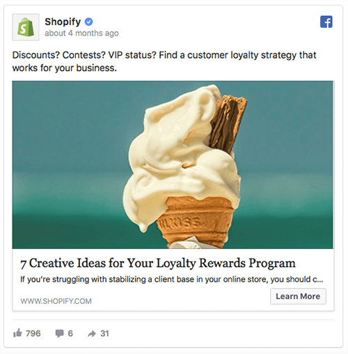
Blog post ad from ecommerce platform Shopify.
The short, punchy copy triggers curiosity with three one-word questions that the promoted content answers. Users are sucked in, knowing that they already use one of the loyalty ideas mentioned (discounts, contests, or VIP status). But are they doing it right? Are there more effective ways? This article provides the answers, which gets people to click.
At first glance, the image seems random. But on further analysis, the image has a nostalgic feel, prompting the user to remember that as a kid, ice cream was a treat or reward. Similarly, this ad links to an article about reward programs. This ad uses visual nostalgia stand out to someone scrolling through their Facebook news feed.
Last but not least, the ad has a solid title and CTA. The listicle-style article grabs attention by starting with a specific number. The ad also features a “Learn More” CTA, which is the exact thing someone will do when they read all about the creative ideas around customer loyalty programs.
#6: Prompt Purchases With a Discount
Gousto is a meal delivery company, and its eye-catching ad mixes value-based video content with a direct response discount promotion.
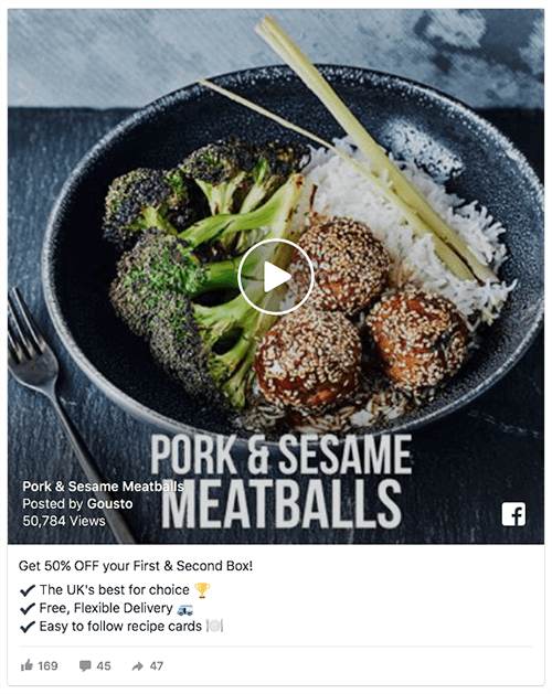
Promotional video ad from Gousto.
The ad copy emphasizes the ad’s value to potential customers. In the first line, you learn about the percentage discount and that it applies not only to your first box, but also your second. The three bullets also focus on benefits by highlighting the wide range of choices, the free and flexible delivery option, and the product’s ease of use.
The copy can also use emojis to make the ad copy stand out. The checkmark emojis at the start of each line and the image emoji at the end of each line grab the target audience’s attention.
The video and CTA flow directly from the ad copy. The video demonstrates how the recipes in the meal boxes are easy to prepare, demonstrating the idea in the last bullet. Also, the Order Now CTA is consistent with the tone of the ad, in that it’s a direct response ad first and a content ad second.
#7: Reveal a Flash Sale
This ad from beauty brand feelunique.com promotes a flash sale on Kérastase. For maximum impact in the Facebook news feed, the ad features an image that’s larger than images in most other link ads.

A large image makes this flash sale ad from feelunique.com stand out.
Each segment of the image highlights something important about the sale. The top segment features the sale offer. The full-width lifestyle image features the product, and the focus on the model’s hair illustrates the product’s benefit. The third and fourth images feature other sale products in the same hair-care line.
The ad copy creates a sense of urgency. The first line of copy builds scarcity by implying that the product will be selling fast and it’s a race to take advantage of the sale. The second line tells you the percentage discount and the specific product line. The final line of copy features the CTA with a Google tracking link to the product page.
#8: Share Customer Testimonials
This retargeting ad from Two Become One Jewellery mixes direct response messaging in the video and a testimonial in the ad copy. The video introduces the business owner and the testimonial adds social proof to the ad. In your ad copy, testimonials are among the most effective ways to build trust and encourage potential customers to take action.
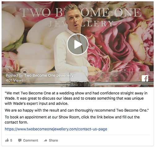
Testimonial retargeting ad from jeweler Two Become One.
The testimonial hits four specific customer insights:
- The customer had confidence in the business.
- The product offering was unique.
- The customer was happy with the product.
- The customer would recommend the company.
In the second half of the copy, the CTA gives users specific instructions on how to get in contact with the business.
The video also plays an important role in this ad. By introducing the business owner, the video adds a face to the business. After all, people do business with other people. The video takes place in the company’s showroom, states the specific service the company offers, and ends with a CTA.
#9: Promote Scarcity and Exclusivity
This ad from watch brand Larsson & Jennings takes an interesting approach to a discount promotion. Elements of exclusivity and scarcity encourage the target audience to take action.
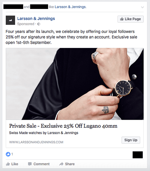
Ad for an exclusive sale from watch brand Larsson & Jennings.
To create exclusivity, the ad copy specifies that you need to create an account to take advantage of the offer. To convey scarcity, the sale takes place during a short period of time, between the September 1 and 5. This scarcity demands that the target audience takes immediate action.
Because the promotion is tied to a particular product, the image shows the product. Again, as in the Kit & Kin example, the product image displays the product in use instead of a boring image of the product on its own.
Below the image, the first section of the link title stresses the exclusive element of the offer, “Private Sale.” The link title reiterates the discount percentage and the specific product on offer.
For the CTA, instead of Shop Now, which you see in most product promotions, the audience is prompted to Sign Up. This CTA reinforces that people need to create an account before they can take advantage of the offer.
#10: Advertise a Lead Magnet
This Leadpages ad is a perfect example of how to advertise a lead magnet. This Facebook ad is used at the top of the marketing funnel to generate email subscribers, who can later be upsold to the Leadpages software.
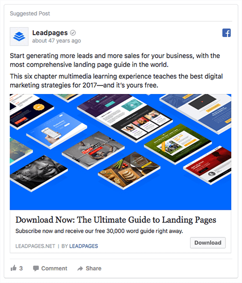
Advertise a lead magnet to meet your marketing goals.
Once again, the ad copy emphasizes benefits. The ad opens strong with the main benefit of the guide, generating more leads and sales. After this bold claim, the ad copy stresses the guide’s in-depth nature. The second paragraph explains the guide’s length, its relevance (being up to date for 2017), and that the guide is free.
The image grabs your attention right away thanks to the blue background color, the same blue from the logo to reinforce the brand. The landing page examples in the image immediately reinforce that this ad is all about landing pages. In other words, the image is consistent with the ad text and link title.
The first half of the link title features the same CTA as the button to provide continuity. The second part of the link mentions the title of the lead magnet.
#11: Present Use Cases
This great ad from Philips uses both video content and the carousel ad format. Each video demonstrates a use case of their new OneBlade razor.
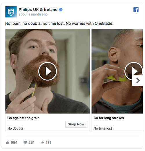
In a video carousel ad, Philips presents several use cases for its product.
The ad copy is short and sweet. The two-sentence copy precisely hits the benefits of using the product. The copy is quick to read, just as the razor makes shaving quick and easy. The ad copy piques the readers’ interest so they watch the videos in the carousel.
Below the ad copy, in each use case video, the audience sees a different demonstration that illustrates the product’s flexibility. Also, in each video, the carousel title and description use a clever approach. Each title talks about a product action, such as “Go against the grain.” The carousel description follows with a benefit, such as “No doubts.”
The carousel descriptions also reinforce the benefits in the main ad copy. After the ad copy and carousel make a strong case for buying the product, the Shop Now CTA takes people to the product page to make a purchase.
Read this article here


